Module 5: CSS and Interaction
Topics in
this Module
Introduction
Interaction is one of the things that makes the Web so great, and one of the things we can do as designers to enhance the user experience on our web pages. We can use interactive elements to give feedback to a user, to make our pages more fun, and make them easier to use by highlighting the parts of the page that a user can interact with.
The most important part of a web page that a user typically interacts with is a hyperlink, or link. By default, links look pretty boring and simple. The default appearance of links on a web page has evolved over time, influenced by both technological advancements and design trends. Here, I'll explain the default appearances for different types of links you might find on a web page, along with some historical context:
Unvisited Links:
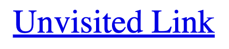
Default Appearance: Historically, unvisited links were typically displayed as blue text with underlines. This color choice was partly due to convention and partly due to the limited color palette available in early web browsers.
Historical Context: In the early days of the World Wide Web, web browsers like Mosaic and Netscape Navigator used blue underlined text to denote unvisited links. This convention helped users identify clickable content.
Visited Links:

Default Appearance: Visited links were traditionally displayed as purple text with underlines. This color change was used to differentiate visited links from unvisited ones.
Historical Context: The color purple was chosen as a visual indicator because it was distinct from the blue used for unvisited links. This helped users keep track of the links they had already visited.
Active Links (Links Being Clicked):
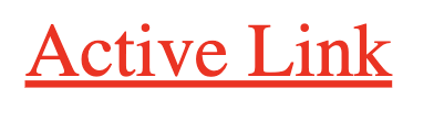
Default Appearance: Active links, i.e., links that are currently being clicked, often appeared as red text with underlines, giving users immediate feedback that the link was being activated.
Historical Context: The use of red for active links was a common practice to provide users with visual feedback during the click action.
It's important to note that the default appearances for links can vary based on the web browser being used, the website's design choices, and the user's system settings. Additionally, modern web design has moved away from some of these historical conventions, allowing for greater creativity and customization in link styling. Today, designers often use CSS to style links in unique and visually appealing ways, and link appearances can vary widely across websites.
Links on Today's Web
Now, we have much more powerful tools to create links, and to make our pages look much more attractive. While browsers still default to these same appearances for links, you don't see the plain blue link as often as you once did. In this module, we'll explore some ways to use CSS to make our links really stand out and also interact with our users.
The CSS Display Property
The CSS display property is used to control how an HTML element is displayed in the web page layout. It determines the type of box an element generates and how it interacts with other elements. There are several values for the display property, each with its own set of effects on the display of elements. In this module, we will use the display property to change the appearance of links within a page.
Here are the most common display property values:
inline:
Effect: Elements with display: inline; generate an inline-level container that flows within the content, allowing elements to appear on the same line as one another. This is the default value for links.
Example:
Take the following HTML:
<html>
<head>
    <title>Test Page</title>
</head>
<body>
    <h1>This is a heading</h1>
    <p>
        This is a fake sentence.This is a fake sentence.This is a fake sentence.
        This is a fake sentence.This is a fake sentence.This is a fake sentence.
        <a href="https://www.example.com">My Link</a>
        This is a fake sentence.This is a fake sentence.This is a fake sentence.
        This is a fake sentence.This is a fake sentence.This is a fake sentence.
    </p>
</body>
</html>
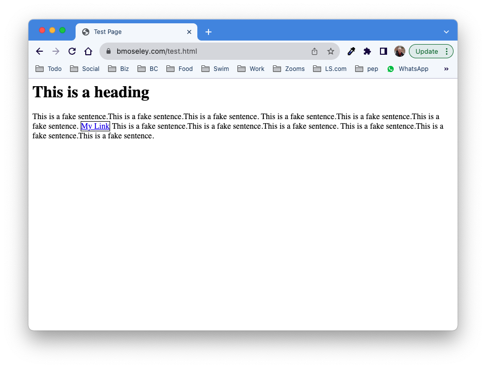
It will result in the following web page display. You can copy and paste the code into an HTML file to try it for yourself:
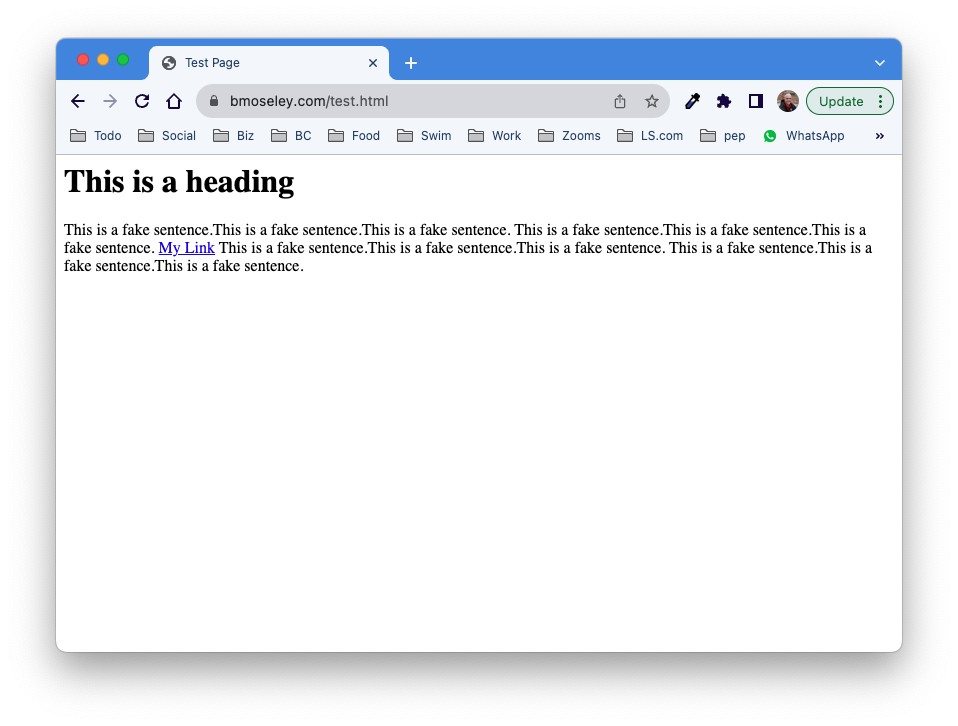
The link in this case is displaying using the default display mode for links, which is “inline”. If you were to write the following code, you would get the same result:
<html>
<head>
    <title>Test Page</title>
    <style>
        a {
            display: inline;
        }
    </style>
</head>
<body>
    <h1>This is a heading</h1>
    <p>
        This is a fake sentence.This is a fake sentence.This is a fake sentence.
        This is a fake sentence.This is a fake sentence.This is a fake sentence.
        <a href="https://www.example.com">My Link</a>
        This is a fake sentence.This is a fake sentence.This is a fake sentence.
        This is a fake sentence.This is a fake sentence.This is a fake sentence.
    </p>
</body>
</html>
While I've added the <style> tags in the header with a rule for all <a> tags to display using “inline”, it has no effect because links already display in this way.
block:
Effect: Elements with display: block; generate a block-level container that spans the full width of its parent container and typically starts on a new line.
Example:
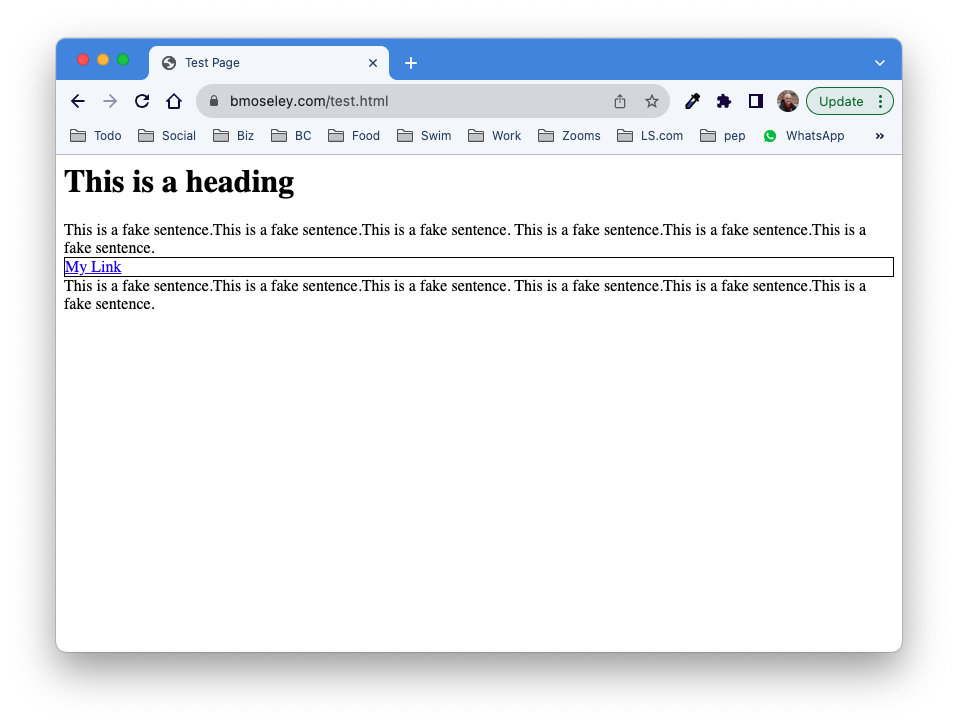
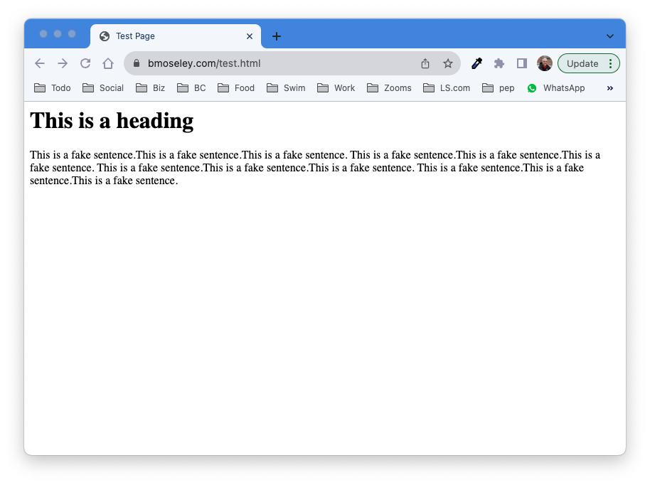
If I change the display property to “block”, like this:
<html>
<head>
    <title>Test Page</title>
    <style>
        a {
            display: block;
        }
    </style>
</head>
<body>
    <h1>This is a heading</h1>
    <p>
        This is a fake sentence.This is a fake sentence.This is a fake sentence.
        This is a fake sentence.This is a fake sentence.This is a fake sentence.
        <a href="https://www.example.com" target="_blank">My Link</a>
        This is a fake sentence.This is a fake sentence.This is a fake sentence.
        This is a fake sentence.This is a fake sentence.This is a fake sentence.
    </p>
</body>
</html>
I get the following result:

The link is now sitting on a line of its own. what you can't see is that the container that makes up the link spans the whole width of the window. Let's add a border property to the <a> tag to show the area that the box takes up. To do this, add the following code right underneath the display: block; line inside the {} for the anchor tag in the style block:
border: 1px solid #000000
Now, our web page looks like this, revealing the whole width of the <a> tag:
So elements that are set to display “block” take up the whole width of the window. Examples of these tags include <p>, <div>, and <h1> - <h7>.
inline-block:
The “inline-block” display shares some elements of both “block” and “inline”. In these elements, there is still a box around the element (invisible unless you say otherwise), but the box doesn't take up its own line and fill up the width of the entire window.
Effect: Combines the characteristics of both inline and block. It creates a block-level container but behaves like an inline-level element within that block, allowing multiple inline-block elements to appear side by side.
Note: This is the value we will use to change the appearance of links, making them look like buttons.
Example:
If we change the display value for the <a> tag in the code above (leaving the border turned on) to inline-block, we get the following:
In this case, the link displays with a box around it, but it doesn't take up its own line.
none:
Effect: Elements with display: none; are not displayed at all in the layout. They are completely hidden and do not take up any space.
Use Cases: Often used for elements that should be hidden and then made visible dynamically using JavaScript or CSS.
If we change the display value to “none”, we get the following result:
Notice that not only does the element disappear, the border of the box is gone as well. This is often used to show and hide elements of a page based on user actions.
Summary
These are some of the common display property values in CSS. There are others, but we are going to start with the more common, simpler ones for now. The choice of display value depends on your layout and design requirements, and using them effectively can help create the desired structure and appearance for your web page elements. Additionally, modern CSS also includes values like grid, flex, and more that offer powerful layout capabilities for building complex and responsive designs.
CSS Pseudo-Classes
CSS pseudo-classes are special keywords that allow you to select and style elements based on their state or position within the document, without the need for adding extra classes or attributes to the HTML elements. Pseudo-classes are preceded by a colon (":") and can be applied to various HTML elements to create interactive and dynamic effects for users. One common use of pseudo-classes is for styling anchor (<a>) tags to create interactive effects like hover and visited states.
Here's an explanation of some commonly used pseudo-classes for <a> tags:
:link
This pseudo-class selects anchor tags that have not been visited.
It is commonly used to style links that haven't been clicked yet.
Example:
a:link {
    color: green;
}
In this example, the color of the unvisited link is changed from its default color (blue) to a new color (green).
:visited
This pseudo-class selects anchor tags that have been visited by the user.
It allows you to style links differently after the user has clicked on them.
Example:
a:visited {
    color: orange;
}
In this example, the color of the visited link is changed from its default color (purple) to a new color (orange). You may also wish to keep the color of visited links the same color that they were before they were visited in order to preserve your site's color scheme/design.
:hover
This pseudo-class selects anchor tags when the mouse pointer is hovering over them.
It is useful for creating interactive effects when the user hovers over links.
Example:
a:hover {
    text-decoration: underline;
    color: blue;
}
This code will cause the link to become underlined (if it isn't already) and turn blue when the mouse pointer hovers over it. This is a useful effect that helps users more easily see elements of your page that are interactive, or “clickable”.
:active
This pseudo-class selects anchor tags while they are being activated, typically when the user clicks on them.
It is often used to provide visual feedback when a user interacts with a link.
Example:
a:active {
    color: black;
}
This code will turn the link black when it is being clicked.
:focus
This pseudo-class selects anchor tags that have keyboard focus or are currently selected by other means (e.g., through screen readers or keyboard navigation).
It is essential for ensuring accessibility and improving user experience.
Example:
a:focus {
    outline: 2px solid green;
}
By using these pseudo-classes, you can create interactive and visually appealing effects for links on your website. These effects help users understand the state of the links they are interacting with, making your website more user-friendly and engaging. CSS pseudo-classes are a powerful tool for enhancing the user experience without the need for additional HTML markup or JavaScript code.
CSS Link Buttons
Cascading Style Sheets (CSS) can be used to create various button effects for links in an HTML document. Below, I'll provide examples of different button styles and methods with commented code samples for each.
Example 1: Basic Button Style
In this example, we'll create a basic button effect for a link:
HTML:
<!DOCTYPE html>
<html>
<head>
    <style>
    </style>
</head>
<body>
    <a>Click Me</a>
</body>
</html>
CSS (styles.css):
/* Define the basic button style */
a {
    display: inline-block;
    padding: 10px 20px;
    background-color: #007bff;
    color: #fff;
    text-decoration: none;
    border-radius: 5px;
}

/* Add hover effect */
a:hover {
    background-color: #0056b3;
}
In this example, we create a button by applying CSS styles to the anchor (<a>) element. The button class defines the basic button style with background color, padding, and text color. The hover pseudo-class is used to change the background color when the mouse hovers over the button.
Example 2: 3D Button Effect
This example demonstrates a 3D button effect:
CSS:
/* Define the 3D button style */
a:link {
    display: inline-block;
    padding: 10px 20px;
    background-color: #007bff;
    color: #fff;
    text-decoration: none;
    border: 2px solid #0056b3;
    border-radius: 5px;
    box-shadow: 2px 2px 5px rgba(0, 0, 0, 0.2);
    transition: transform 0.2s ease-in-out;
}

/* Add hover effect and pressed effect */
a:hover {
    background-color: #0056b3;
}

a:active {
    transform: translateY(2px);
}
In this example, we create a 3D button by adding a border, box-shadow, and a transform effect when the button is pressed (:active). The transition property provides a smooth animation when the button is pressed.
Example 3: Gradient Button
This example showcases a gradient button effect:
CSS :
/* Define the gradient button style */
a:link {
    display: inline-block;
    padding: 10px 20px;
    background: linear-gradient(45deg, #ff6b6b, #007bff);
    color: #fff;
    text-decoration: none;
    border: none;
    border-radius: 5px;
}

/* Add hover effect */
a:hover {
    background: linear-gradient(45deg, #ff4141, #0056b3);
}
In this example, we create a gradient button using the linear-gradient property for the background. The gradient changes when the button is hovered over.
These are just a few examples of button styles using CSS for links in HTML. CSS provides extensive flexibility, allowing you to create various button effects based on your design preferences and requirements. You can further customize these styles or combine them to achieve unique button effects for your web projects.
Applying These Styles Using Selectors
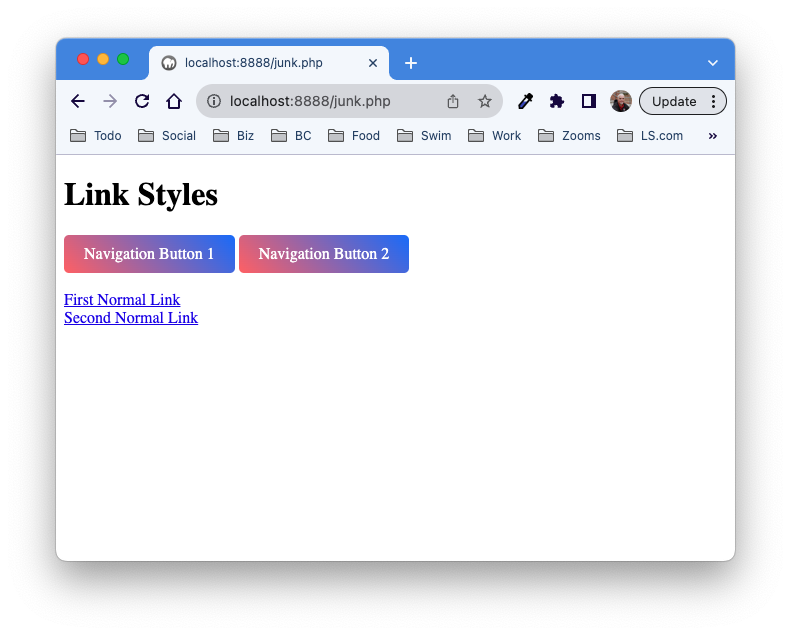
In the examples above, we are using the tag selector “a” to apply the styles to our html links. In this case, all of our links will have the button styles that are applied. In order to apply the styles to lust some links, we might try a class selector instead. This would allow us to have some links that looked “normal” and some that look like buttons. The code below shows how this would work, using the CSS styles from the third example above (the Gradient Button). Notice that there will be two “button” links and two “normal” links when this is viewed in a browser.
<!DOCTYPE html>
<html>
<head>
    <style>
        /* Define the gradient button style */
        .nav:link {
            display: inline-block;
            padding: 10px 20px;
            background: linear-gradient(45deg, #ff6b6b, #007bff);
            color: #fff;
            text-decoration: none;
            border: none;
            border-radius: 5px;
        }

        /* Add hover effect */
        .nav:hover {
            background: linear-gradient(45deg, #ff4141, #0056b3);
        }
    </style>
</head>
<body>
    <h1>Link Styles</h1>
    <a class="nav">Navigation Button 1</a>
    <a class="nav">Navigation Button 2</a>
    <br>
    <a>First Normal Link</a>
    <br>
    <a>Second Normal Link</a>
</body>
</html>
You can see above that the “button” links have an attribute that says class="nav", and also that in the CSS above instead of the selector starting with “a”, it begins with .nav instead. This says that everything in the HTML that has a class of “nav” will have those styles applied.
Here's how the page looks:
Module 5 Challenge Video
Videos for Module 5: CSS and Interaction
There are no videos yet this term for this Module. Check back soon!
Activities for this Module
S5 - 3D CSS Button
In this sandbox, we’re going to have some fun using CSS to turn a plain old link into an interactive button with 3D effects. I’ll walk you through each style declaration that we add, so you know what each one does. At the end, I’ll challenge you to get creative and make the button your own by going back and changing things around.
First, open Liveweave.
Next, you need to add a basic link to the HTML section. Replace the existing paragraph with the following:
<a>This is a Link</a>I’ve left off the href attribute because I don’t want the link to go anywhere when we click it.
You can delete the code in the CSS pane, because we won’t need it.
Ok - Let’s get started. First, let’s add a tag-based selector to the CSS pane for the a tag, like this:
a {

}
Everything we do in this next part will be added between those curly braces.
Let’s start making that button. I’ll give you each declaration to add, followed by a brief explanation of what it does. (Time to use COPY / PASTE!)
display: inline-block;Setting the display to inline-block causes the link to take on traits of both inline elements (links are “inline” by default) and “block” elements. The effects that are important to us here is that this allows us to control the height, width, margin and padding. I’ll talk about these when we get there. Basically, we’re turning the link into a box that can be resized, but can also be in a line of text.
text-decoration: none;This removes the underline from the link. Normally, we wouldn’t want to do this because on the web an underlined piece of text is how we recognize links. But since we are making a button, the underline would look weird.
border: 2px solid #000000;Now that we have a box around our link, let’s make the border visible. Notice that we are telling the border to be 2px (pixels) thick, solid (try these other settings for fun: solid, dotted, dashed. double, groove, ridge, inset, and outset), and the border color is black. This stacking of properties in a single declaration is called a shorthand property. You could also use separate declarations for each of these, using border-width, border-style, and border-color.
padding: 10px;Padding is the amount of space between the border of the box and whatever is inside of the box. If the size of the box isn’t set, or the size of the box doesn’t allow for at least this amount of space, then the box size will be increased to allow for this amount of padding. We haven’t set the size of the box yet, so when you add this you will see the box grow to allow for 10 pixels of space on each side of the link text. You can set padding on an individual side using padding-left, padding-right, padding-top, and padding-bottom, or you can use the shorthand version, padding: 10px 20px 10px 20px. In this case, the number start at the top, and go clockwise around the four directions. (top, right, bottom, left).
width: 250px;
height: 75px;
In these two lines, we set the minimum height and width of the container. If the contents + padding are bigger than this, the button size will grow to accommodate them. That’s a good thing to keep in mind as you plan your layout.
line-height: 75px;This setting, line-height, is useful for vertically centering the text in the button. This is done by making the height of the line the same number as the height of the button. Note that if you have more than one line of text in the button, this won’t work.
text-align: center;This declaration will center the text horizontally in the button. Other possible values include right and left.
border-radius: 10px;Setting the border radius will make the corners of the rectangular button look round. The higher this number, the more round the button will look. Go ahead and play around with this number and see what happens.
font-family: Impact, Arial, sans-serif;This sets the font that should be used in the button text. By default on the web, fonts will only show up if the computer or device the user is viewing the page with has that font installed. For this reason, we often specify second choice fonts and then a font category as backups so that we can keep at least some control over the design. It’s a good idea to stick to standard system fonts for most designs if you want them to show up properly. If you want to do a deeper dive into web-safe fonts, check out this article Links to an external site..
font-size: 30px;Font size is always a measure of the height of the font. However, there are several different approaches to specifying the height:
Absolute-size keywords: These keywords map to a specific font size based on the user agent's default font size settings (usually 16px for medium). They are less flexible as they do not adjust based on the parent element's font size.
- xx-small
- x-small
- small
- medium (default)
- large
- x-large
- xx-large
Relative-size keywords: These are relative to the parent element's font size.
- smaller: Smaller than the parent element’s font size.
- larger: Larger than the parent element’s font size.
Length values: You can specify the font size in fixed or relative units.
- px (pixels): Absolute unit and one of the most common ways to specify font size.
- em: Relative to the font size of the element (2em means 2 times the size of the current font).
- rem: Relative to font-size of the root element (<html>).
- pt (points): Another absolute font size, traditionally used in print (1pt = 1/72 of an inch).
- cm, mm, in, pc (picas): Other absolute dimensions, not commonly used for screen display.
- Percentage: Specifies the font size as a percentage of the parent element's font size. e.g., 150%, 80%
Viewport-relative sizes: Useful for responsive design, making the font size adjustable based on the size of the viewport.
- vw (viewport width): 1vw = 1% of the viewport's width.
- vh (viewport height): 1vh = 1% of the viewport's height.
- vmin: 1vmin = 1% of the viewport's smaller dimension.
- vmax: 1vmax = 1% of the viewport's larger dimension.
I know that's a lot. Just remember that while it's helpful to know what's out there and what you can do, you don't have to use all of the options to be a great web designer. Honestly, I use px about 90% of the time.
background: rgb(43,158,158);
background: linear-gradient(0deg, rgba(43,158,158,1) 3%, rgba(95,230,232,1) 33%, rgba(249,251,244,1) 71%);
Note that the line above may wrap because it's too long to display on a single line.
This is code to create a gradient background for the button. It’s part of the 3D effect. For now, you don’t need to understand it beyond knowing that there are two declarations. The first is a flat background color in case the user is on an older web browser or a web browser that doesn’t support gradients. The second is the gradient itself. To make your own gradient for the button, visit the CSS Gradient GeneratorLinks to an external site. — It will provide you with code that you can just copy and paste.
color: white;This sets the color of the text. You want to make sure there is plenty of contrast between the text and the color of the button. However, the drop shadow we will add soon will help with that. Once you see the finished product, you might want to make some minor changes to colors to make sure everything is readable.
box-shadow: 9px 9px 10px #000000;The box-shadow property in CSS is used to add shadow effects around an element's frame. The shorthand you provided, box-shadow: 9px 9px 10px #000000;, can be broken down into several components, each specifying different aspects of the shadow:
- Horizontal Offset (9px): This value determines the horizontal distance of the shadow from the element. A positive value places the shadow to the right of the element, while a negative value would place it to the left.
- Vertical Offset (9px): This value sets the vertical distance of the shadow from the element. A positive value places the shadow below the element, and a negative value places it above.
- Blur Radius (10px): This value dictates how blurred the edges of the shadow are. The larger the value, the more blurred and larger the shadow appears. If set to 0, the shadow will be sharp, with no blurring effect.
- Color (#000000): Specifies the color of the shadow, in this case, black (#000000). Color can be specified using hexadecimal values, RGB, RGBA (which includes alpha transparency), HSL, or HSLA formats.
Take note that shorthand is the only way to specify these properties.
text-shadow: #000000 1px 1px 5px;The text-shadow property in CSS is used to apply shadow effects to text. The text-shadow property is somewhat similar to box-shadow, but it is specifically for text. The syntax allows for multiple shadows to be specified and consists of the following components:
- Horizontal Offset: This value indicates the horizontal distance of the shadow from the text. A positive value offsets the shadow to the right, while a negative value offsets it to the left.
- Vertical Offset: This value determines the vertical distance of the shadow from the text. A positive value offsets the shadow downward, and a negative value moves it upward.
- Blur Radius (optional): This optional value defines how much the shadow is blurred. It determines the spread of the color at the shadow's edges. A larger value results in a more diffused, softer shadow, while a value of 0 creates a sharp, clear shadow. If omitted, the default blur radius is 0.
- Color (optional): Specifies the color of the shadow. If not defined, it defaults to the color of the text. Colors can be defined using color names (e.g., red), hexadecimal values, RGB, RGBA, HSL, or HSLA values.
-webkit-text-stroke-width: 1px;
-webkit-text-stroke-color: black;
The CSS properties -webkit-text-stroke-width and -webkit-text-stroke-color are used to specify the width and color of a stroke around text characters, respectively. These properties are prefixed with -webkit-, which means they are intended for browsers that use the WebKit rendering engine.
As of 2024, here's the support for these properties across various browsers:
- Google Chrome: Chrome supports these properties because it is built on the Blink engine, which is a fork of WebKit. Chrome has supported these properties for several versions, making it one of the best browsers for these features.
- Safari: Safari, which uses the WebKit engine, also supports -webkit-text-stroke-width and -webkit-text-stroke-color. These properties have been supported for many versions and work well on both macOS and iOS versions of Safari.
- Opera: Opera, like Chrome, is based on the Blink engine and therefore supports these properties.
Beyond that, the effects of these declarations might be ignored (the default behavior for anything a web browser doesn’t understand). So, while these are fun, use them with caution or have a solid backup plan.
margin-right: 15px;This last declaration sets the right margin of the button to 15 pixels. The margin is very similar to the padding of an element, except the margin specifies the space outside the element between the border and any other elements that are adjacent to it on the outside. Margin is the space around the outside of an element.
Like padding, margin can be specified for all sides at once using a single number, individually using properties like we used above for the right side, or using shorthand by giving four numbers for the top, right, bottom and left (in that order).
Our use of margin-right above will make sure that when we add a second link, they don’t crowd too close to one another. Go ahead and try it out in the HTML panel.
That’s it for the <a> tag properties. You should have a pretty nice-looking 3D button in the preview pane now.
Next up, let’s add some interactivity to our button. This can make our interfaces more fun, but also more usable by letting users know that elements on our page can be clicked.
We are going to do this by using what are called pseudoclasses. These are special keywords that can be combined to CSS selectors to apply them to a specific state of the element. There are several different pseudoclasses, but we are going to play with just a few today. The first one is :hover and we are going to use it to apply a highlighting effect to our button when the user puts their mouse pointer over it. It will be as if the button is saying “click me next!”
For this, we are going to create a whole new css block, right below the closing curly brace in the <a> we just finished. This code is short, so I will give you the whole thing at once:
a:hover {
    background: rgb(43,158,158);
    background: linear-gradient(0deg, rgba(43,158,158,1) 0%, rgba(95,230,232,1) 15%, rgba(249,251,244,1) 51%);
}
Note that the line above is wrapping because it's too long to display on a single line.
Notice that we only specify the background here. Paste this into your CSS pane and try putting your mouse pointer over the button. Everything stays the same except the background. That’s one nice thing about pseudoclasses — They still keep all of the main styles for that element, and only change what’s different in the pseudoclass.
Let’s do one more pseudoclass for the <a> tag, so that the button does something cool when we click it. What we’re going to do is override the box-shadow so that it’s a little closer to the button and a little sharper than it was before. This gives a subtle illusion when you click the button that it’s being “pushed” in 3D. Here’s the code:
a:active {
    box-shadow: 2px 2px 5px #000000;
}
There you go! A very cool, interactive 3D button. Now, you can make as many of them as you want by just adding more links. What if you wanted links on the same page that didn’t look like buttons? In that case, you would probably use a class-based selector, and apply it to the <a> tags that you wanted to look like buttons:
<a class='buttonlink'>This is a button</a>
<a>This is not a button</a>
Then the CSS would look like:
.buttonlink {
    … css declarations here …
}
That’s it for now. Be creative now, and make the button your own design! Then take a screenshot and upload it to the forum with your answers to the sandbox questions below.
Post the following:
- You can post screenshots of your code or the results of your code when it is run.
- Something you learned from this.
- Something you struggled with or found difficult.
Please return to this discussion throughout the module, and see if you can either learn from your classmates' work or help them develop their understanding. While I don't count posts, I expect each of you to post your Sandbox Challenge and reply to about 1 classmate per module.
A5 - CSS and Links
The Challenge
Building on A4 html, add CSS to the links that connect to your assignments for this class so that you use a hover pseudo class and styling to make them look like buttons.
The other links on the page should look and behave link "normal" links.
Constraints
- File should be named index.html
Grading / Success Criteria
To earn credit for this assignment, it must:
- Use CSS to turn one or more links into buttons.
- Include pseudo-class interactions (hover, active)
- Build on your existing index.html file.